When you want to drag an OrangeUI button, you will find that it is a bare control. For example, the title font is not centered, and the background color is not. To achieve the effect you want, you have to set it step by step, face to face For the many drawing parameters, you will sigh, this cock control is really fucking difficult to use.
Here, I can only say to everyone: OrangeUI users, everyone has worked hard.
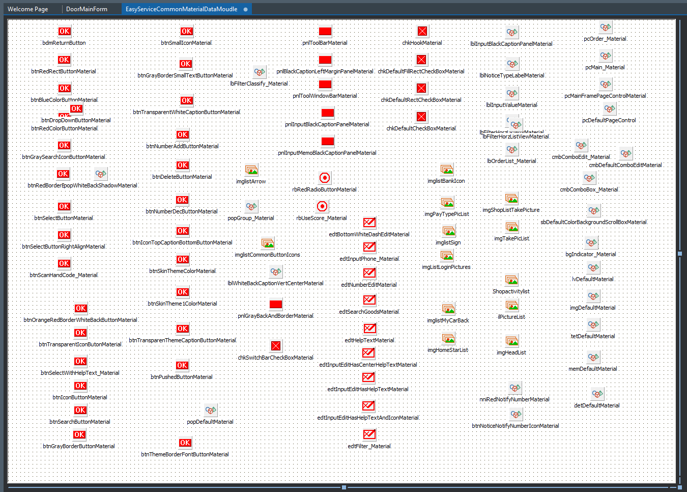
How to change this status quo, then I will introduce our protagonist today, called the public material module. It is actually an alternative form of Delphi, DataMoudule, on which UI controls cannot be placed, but Delphi components can be placed. For example, we often place database connections, datasets, etc. on it for common use by business forms. Then the material component of the OrangeUI control is also a component, so you can put the designed material on it and use it for all pages. When I develop a project, I also put the same style of material on it. It is the EasyServiceCommonMaterialDataMoudle in the control package, which is located in the OrangeProjectCommon directory of the control package. Let’s open it up and take a look:
To use it,
1. The first step, you need to add it to your project:
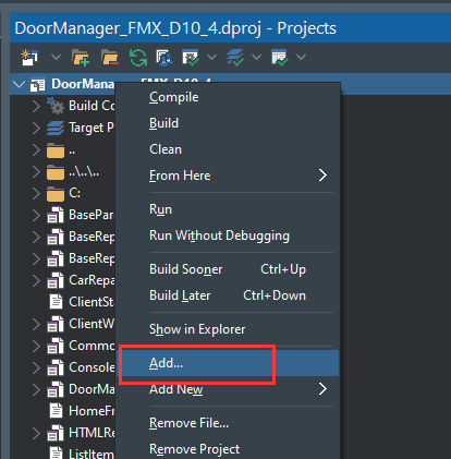
(1) Right-click your project in the project view and select ‘Add…’
(2) 
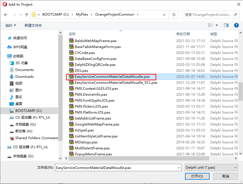
(3) Find the OrangeProjectCommon directory,
Select ‘EasyServiceCommonMaterialDataMoudle.pas’ and click ‘Open’
(4) 
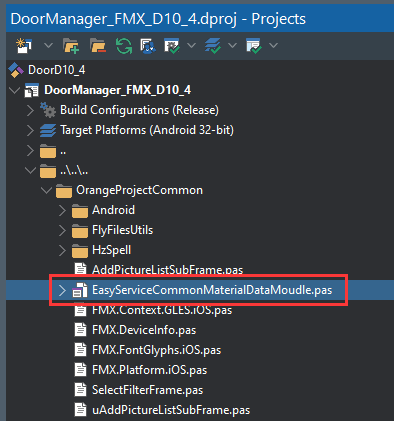
(5) The public material module is added to your project
(6) 
2. Use public materials in the page
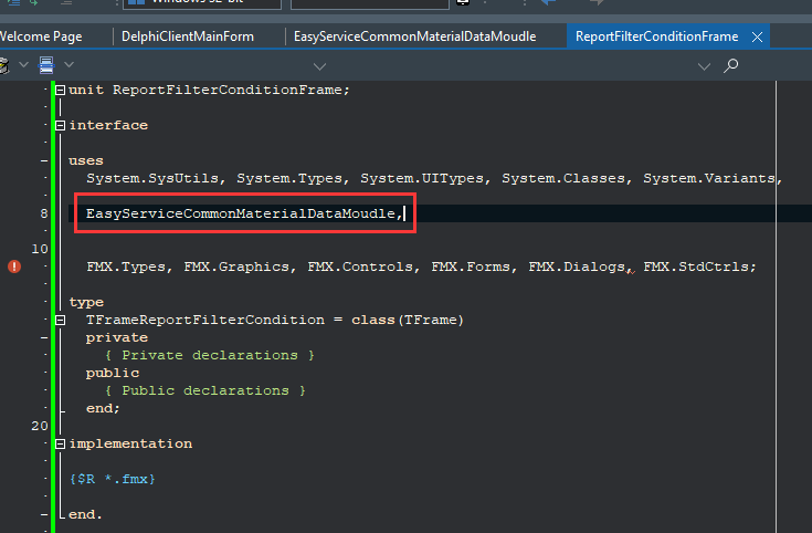
(1) For example, I want to make a report query condition input page ReportFilterConditionFrame,
(2) use public material units
(3) 
3. Determine the APP theme color
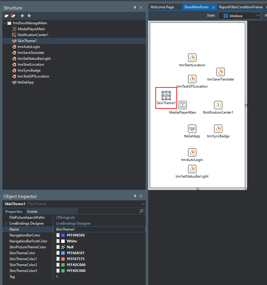
(1) Put a TSkinTheme component in the main form of the project, only one such component needs to be placed in the entire project
(2) 
(3)NavigationBarColor, the background color of the navigation bar
(4)NavigationBarFontColor, the font color of the navigation bar
(5) SkinThemeColor, theme color
(6) SkinThemeColor1, theme color 1
(7) SkinThemeColor2, theme color 2
(8) SkinThemeColor3, theme color 3
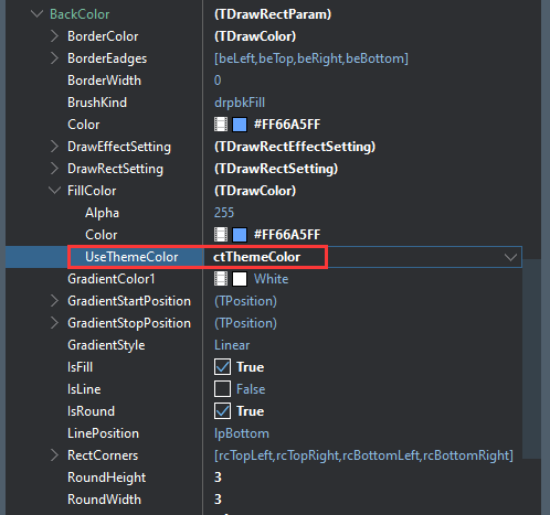
(9) So how to use this theme color in the material? For example, for the background color in the material, we can set BackColor.FillColor.UseThemeColor to ctThemeColor.
(10) 
4. Navigation bar public material
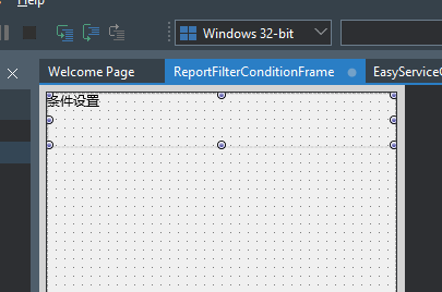
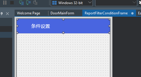
(1) Drag a Panel to ReportFilterConditionFrame, set its Align to Top, its height to 50, Properties.IsToolBar to True, its Name to pnlToolbar, and Caption to “Condition Settings”
(2) At this time, it has not yet set the material, it looks like this:
(3) 
(4) Next, we set the public material for it, and click the arrow to the right of its RefMaterial property
(5) 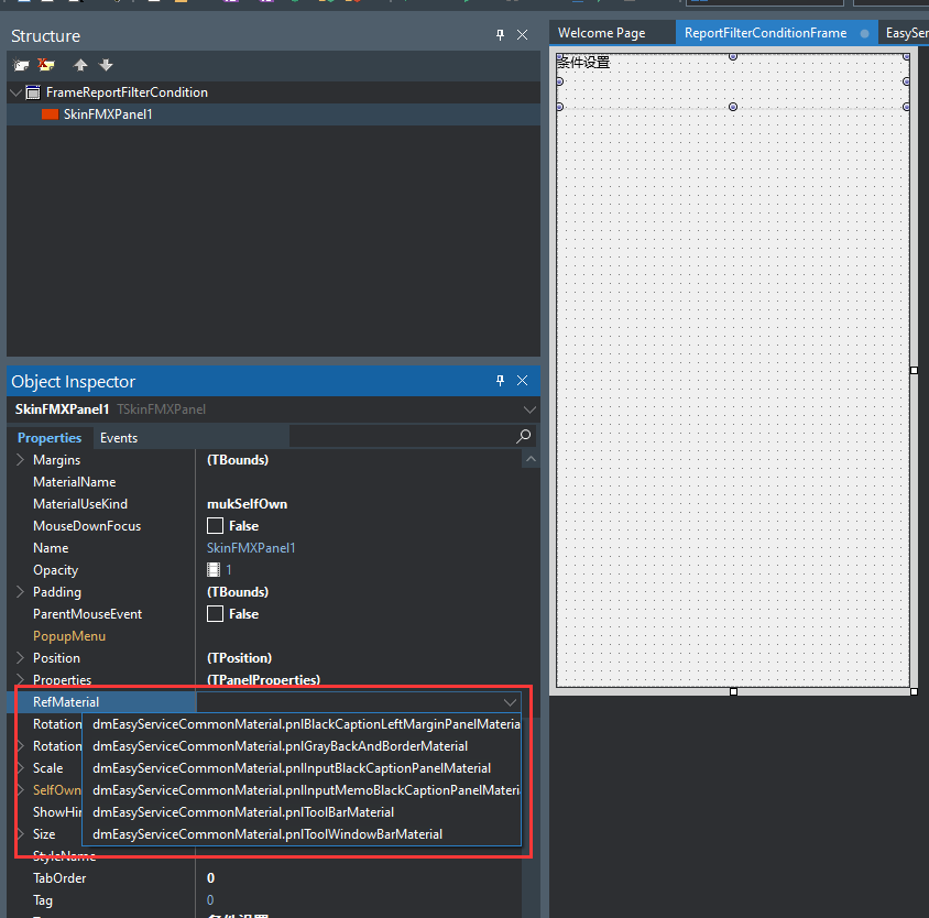
(6) It will list all the material components belonging to the control in the public material module
(7) We choose: dmEasyServiceCommonMaterial.pnlToolBarMaterial, its appearance is set, and we do not need to set the background color, title position, etc. separately.
(8) 
(9)
5. The public material of the return button
(1) We also need a return button, which is already included in the public material module
(2) We put a button on the navigation bar, set its Name to btnReturn, the width to 80, and the Align to Left
(3) 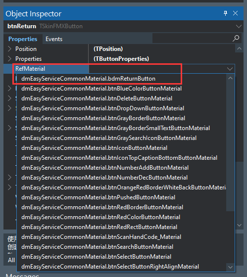
(4) Set its RefMaterial to dmEasyServiceCommonMaterial.bdmReturnButton
(5) 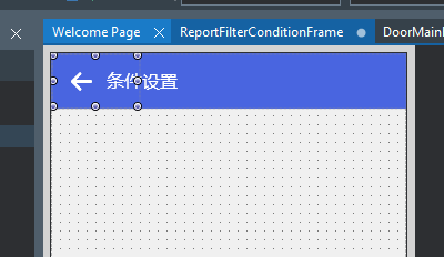
(6) This public material has already set a return arrow icon, so you don’t need to set the icon.
(7)
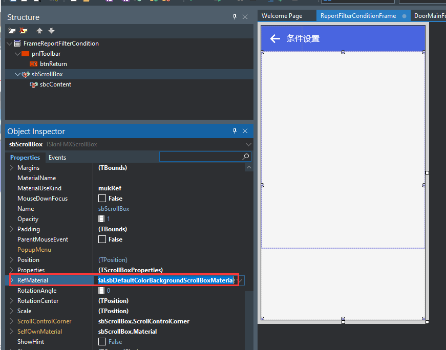
6. Public material of scroll box
(1) Put a ScrollBox, set the Name to sbScrollBox, set its Align to Client,
(2) ScrollBox also has a public material:
(3)dmEasyServiceCommonMaterial.sbDefaultColorBackgroundScrollBoxMaterial
(4) It is a light gray background
(5) 
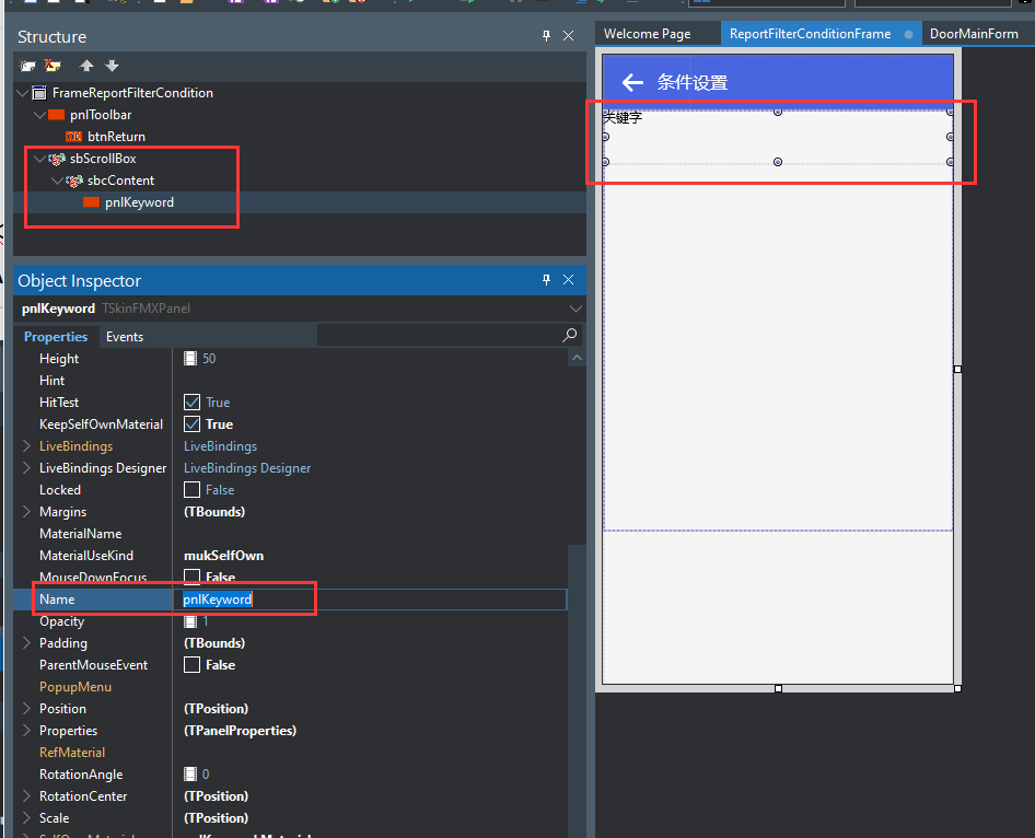
(6) Put another ScrollBoxContent in the ScrollBox, set the Name to sbcContent, and set its Align to Top
(7)
7. Edit
(1) We need to enter keywords,
(2) Let’s put a Panel in sbcContent first, use it as the background and title of the input item, name the Panel pnlKeyword, set the height to 45, set the Align to Top, and set the Caption to the keyword,
(3) 
(4) Set its RefMaterial to:
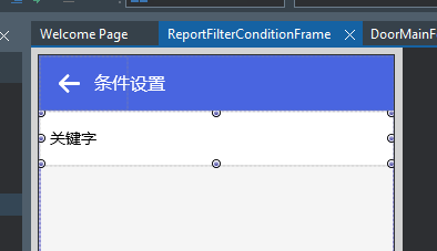
(5) dmEasyServiceCommonMaterial.pnlInputBlackCaptionPanelMaterial, this material has a white background, the title is horizontally centered on the left and vertically, and the font size is 14. The effect is as shown below:
(6) 
(7) Put an Edit in pnlKeyword, set its Name to edtKeyword, its left margin Margins.Left to 80, its Align to Client, and Properties.HelpText to “Please enter a keyword”,
(8) 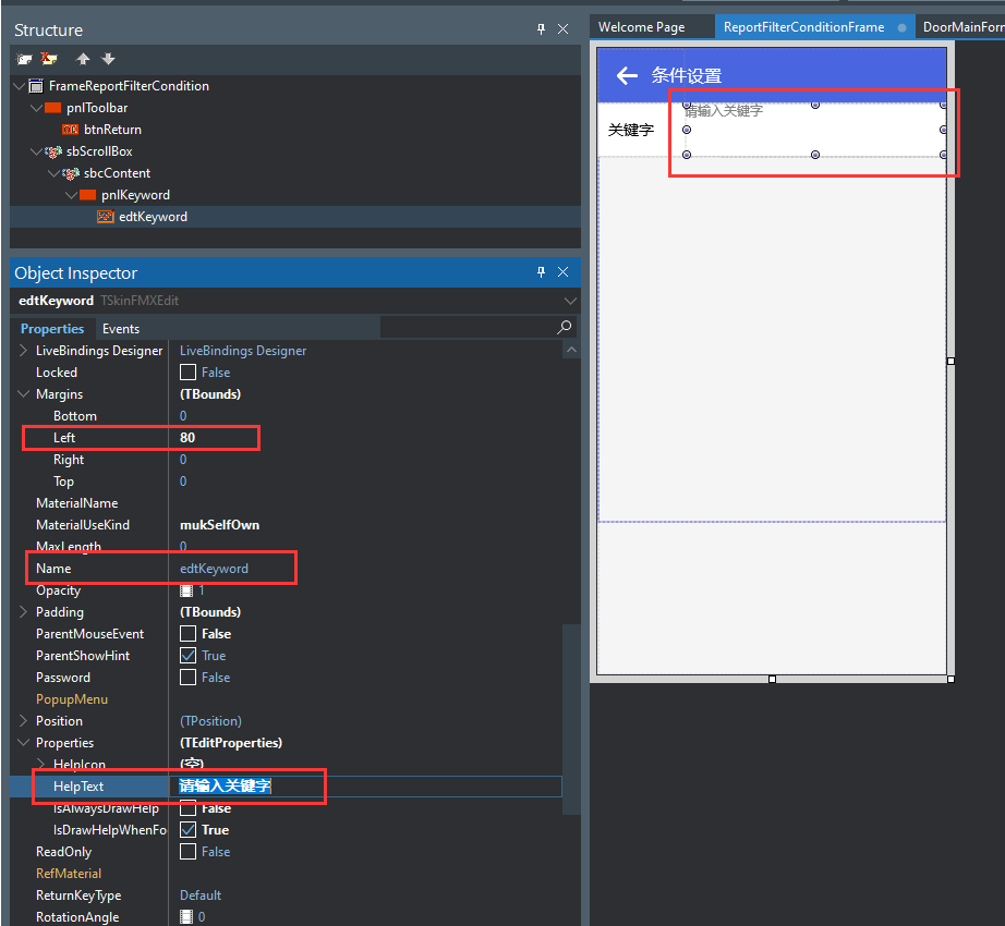
(9) Edit also has public material, we set its RefMaterial to:
(10)dmEasyServiceCommonMaterial.edtInputEditHasHelpTextMaterial, the effect is as follows:
(11) 
(12) This public material has a transparent background, and the prompt text font is gray and vertically centered.
(13)
8. ComboBox
(1) First put an input area Panel, named pnlDoorStructure, to put the door structure drop-down selection box
(2) Put a ComboBox, name it cmbDoorStructure, set its left margin Margins.Left to 80, and set Items, ItemIndex is set to 0, Properties.HelpText is set to “Please select the door structure”, the current effect is as follows:
(3) 
(4) As you can see, the title position is inappropriate, and there is no drop-down arrow.
(5) Then we need to choose a public material for it:
(6) 
9. Options button
(1) Sometimes, we need to select an option by clicking a button and jumping to a special page. This button needs to have a jump prompt icon and prompt text.
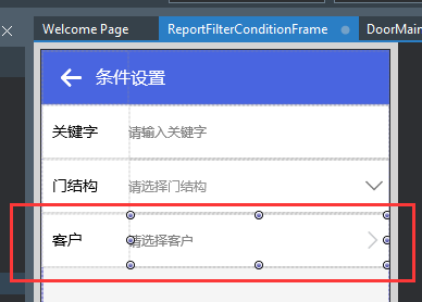
(2) For example, if we want to select a customer, we first put an input area Panel-pnlSelectCompany, and then put a button btnSelectCompany in it, or similar to the above operation, we set the button’s left margin Margins.Left to 80, and Align to Client, Properties.HelpText is set to “Please select a client”
(3) 
(4) Then we choose a public material for it:
(5)dmEasyServiceCommonMaterial.btnSelectButtonMaterial
(6) 
(7)
10. Choose a time frame
(1) We first put an input area Panel-pnlSelectDateArea, and then put a TSkinSelectDateAreaButton control in it, named btnSelectDateArea, this control has two properties, StartDate and EndDate, used to store the start date and end date, and then we put it The material settings are:
(2)dmEasyServiceCommonMaterial.btnSelectButtonMaterial
(3) 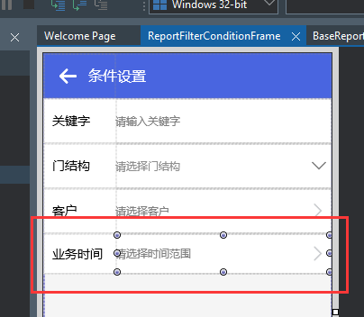
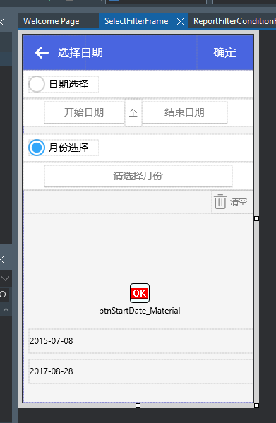
(4) Next, we need to write its click event, so that clicking the button can jump to the page SelectFilterFrame that selects the time range, which is as follows:
(5) 
(6) OK, let’s start writing the click event:
procedure TFrameReportFilterCondition.btnSelectDateAreaClick(Sender: TObject);
begin
//select date range
//search
HideFrame;
ShowFrame(TFrame(GlobalSelectFilterFrame),TFrameSelectFilter,DoReturnFrameFromSelectDateArea);
//Date of completion
GlobalSelectFilterFrame.Load(
btnSelectDateArea.StartDate,
btnSelectDateArea.EndDate,
”
);
GlobalSelectFilterFrame.pnlToolBar.Caption:=’Select’+Self.pnlDateArea.Caption;
end;
(7) When jumping to the page, you need to pass in a method to process the returned event DoReturnFrameFromSelectDateArea, which is used to assign the selected date range to the button. The method code is as follows:
procedure TFrameReportFilterCondition.DoReturnFrameFromSelectDateArea(
AFromFrame: TFrame);
begin
btnSelectDateArea.StartDate:=TFrameSelectFilter(AFromFrame).FStartDate;
btnSelectDateArea.EndDate:=TFrameSelectFilter(AFromFrame).FEndDate;
end;
(8)
11. Checkbox
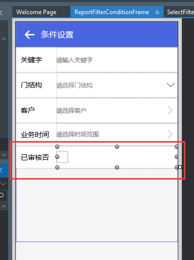
(1) If we want to check whether the document has been reviewed, we need to put a CheckBox in the input area, name it chkIsAudit, set its ComponentTypeUseKind to ctukName, and ComponentTypeName to Color,
(2) 
(3) Then we also choose a public material for it:
(4)dmEasyServiceCommonMaterial.chkDefaultRectCheckBoxMaterial
(5) 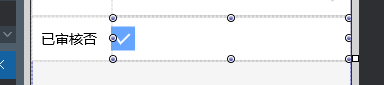
(6) Let’s see what it looks like after it is checked:
(7)
(8) We can see that its background color is our theme color.
(9)
12. RadioButton
(1) I need to choose whether there is an abnormality in the production order, and I need three options: all, no abnormality, and abnormality
(2) Put three RadioButtons in the new input area, named rbExceptionNone, rbExceptionNo, rbExceptionYes,
(3) 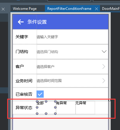
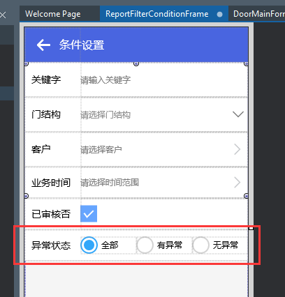
(4) Then we set the ComponentTypeUseKind of the three RadioButtons to ctukName, the ComponentTypeName to Color, the top and bottom margins to 10, and then set a common material for it as:
(5)dmEasyServiceCommonMaterial.rbRedRadioButtonMaterial
(6) 
(7)
13. Function buttons
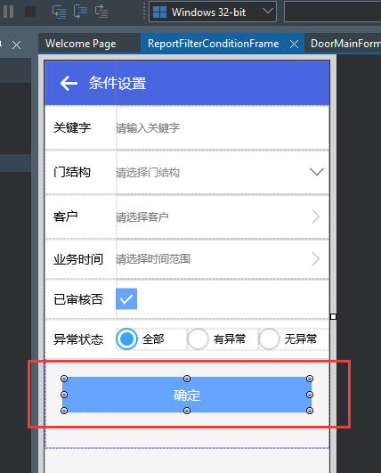
(1) After setting the conditions, we need to click the OK button to execute the query, so we need to put a Button named btnOK, the title is set to OK, the Align is also set to Top, and the top, left and right margins are set to 20,
(2) 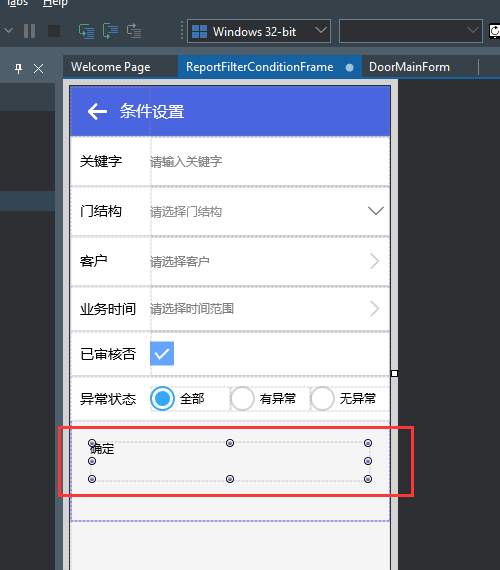
(3)
(4) We select a public material for this button:
(5)dmEasyServiceCommonMaterial.btnSkinThemeColorMaterial, indicating that it is a button with a theme color
(6) 
(7) Let’s take a look at how the theme color is used in this control material:
(8) 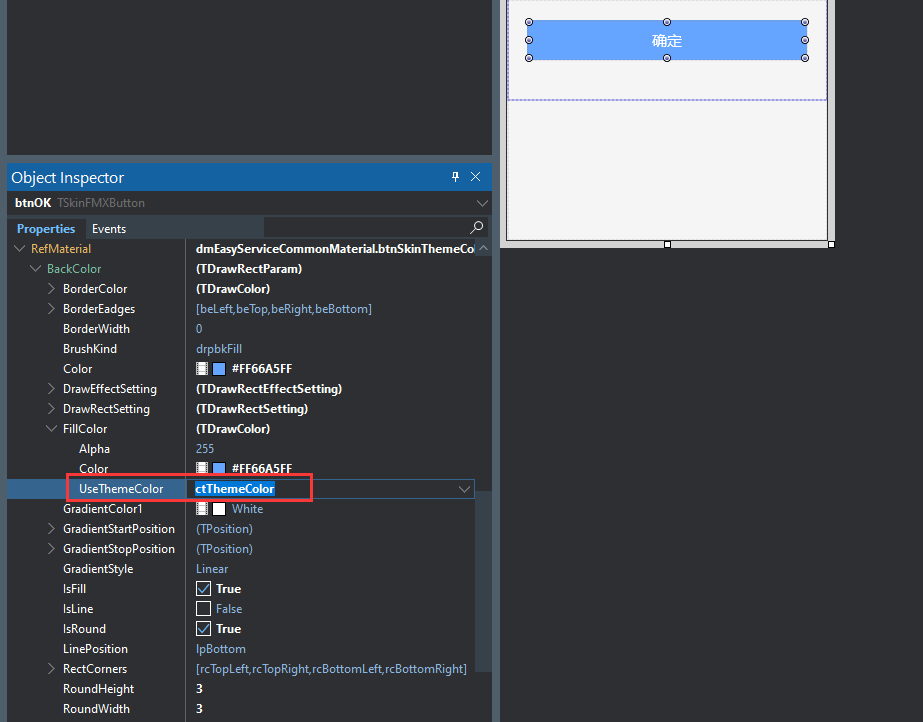
(9) is to set the BackColor.FillColor.UseThemeColor of the material to ctThemeColor, indicating that the theme color is used.
(10) Or some people like to put the button in the upper right corner of the navigation bar, it is also ok.
(11) 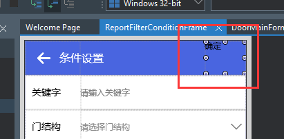
(12) We choose a public material for it:
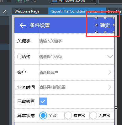
(13)dmEasyServiceCommonMaterial.btnTransparentWhiteCaptionButtonMaterial, which is a button with a transparent background and a white title font, the effect is as follows:
(14) 
(15)
I will briefly introduce the use of public materials here. The common material module EasyServiceCommonMaterialDataMoudle also contains many other materials for other controls, which improves the efficiency of interface development. When developing projects, you can try to use public materials as much as possible. Put it in a DataModule and share it with other pages or other projects.